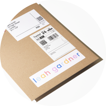
Custom inserts are printed on high quality office printers using a premium textured paper stock. With this in mind, below are some key considerations when designing your custom insert.
Do’s:
- Simple design. Your art print is your artistic showcase to your buyer, so ensure your insert design is stripped back with the focus on the message to the buyer.
- Use of white. Aim to have the majority background colour pure white (#ffffff) this will use the paper’s natural off-white which creates a high-quality look and feel to the insert.
- Light colours. Where colour is required, aim to use a light palette of shades of white, off-white, cream, grey, pastel colours.
Don’ts:
- Dark colours. Avoid strong colours, in particular blacks, dark greys, dark blues etc.
- Large blocks of colour. Aim to utilize the papers natural colour as your background.
- Detailed imagery. Avoid the use of detailed images or photographs. Where you do, use them as accompanying elements rather than dominant features.
- Small font size. Keep your font size above 12pt and ensure good spacing between words and lines of text.
File preparation:
- Spec: Flattened (i.e not layered file)
- Colour space: Adobe RGB 98
- Size: A4 (210 x 297mm)
- Format: PDF
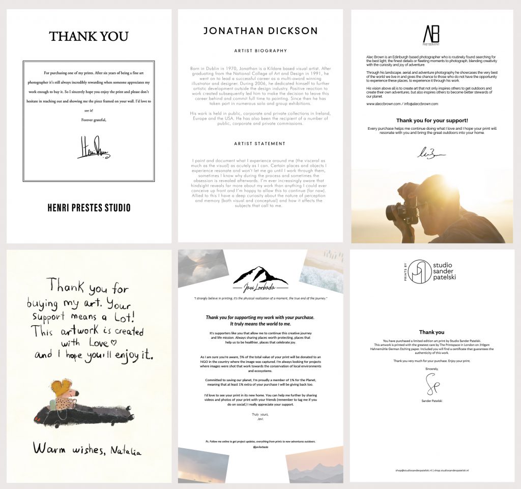
Design examples:
To learn how to upload your custom insert, follow this quick and easy step-by-step guide.